
Meta Description: Discover The Psychology of Color: Choosing Shades That Elevate Luxury Living with Good House Interiors. Explore expert design ideas for stylish upgrades in luxury interiors.
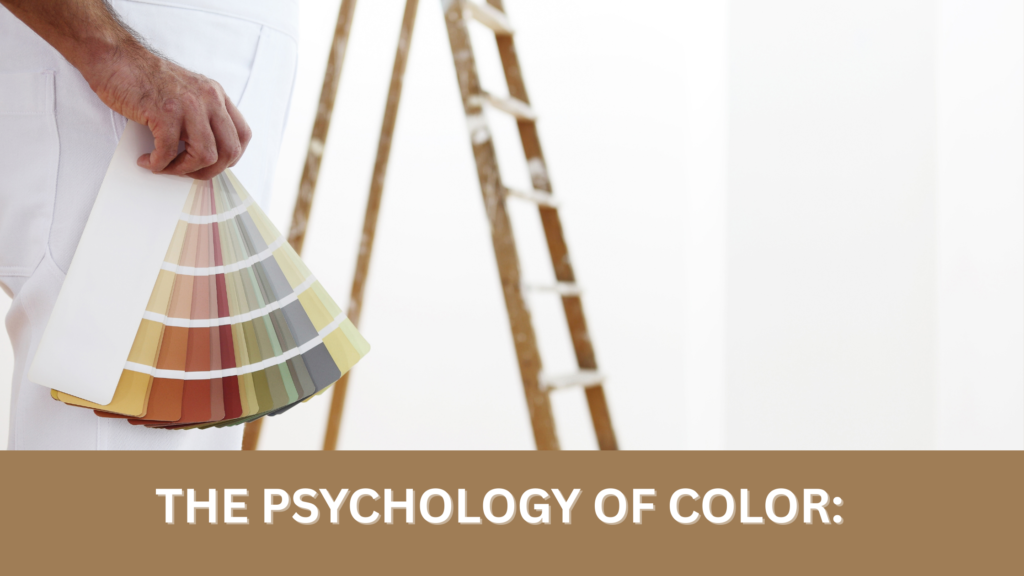
Introduction
Colors are more than surface beauty—they shape moods, influence perceptions, and define the essence of a home. In the world of luxury interiors, every shade has a purpose, weaving together sophistication, comfort, and individuality. This is where The Psychology of Color: Choosing Shades That Elevate Luxury Living becomes a design philosophy rather than a trend. By selecting tones that evoke emotion and enhance balance, Good House Interiors creates timeless spaces that feel both personal and indulgent.
The Psychology of Color in Luxury Interiors
Color psychology is not simply about what looks pleasing to the eye—it’s about how hues alter the way we feel within a room. Luxury spaces thrive when palettes are chosen with intention, creating subtle yet powerful emotional cues.
- Warm shades invite intimacy and richness.
- Cool tones inspire serenity and spaciousness.
- Neutrals offer grounding and understated elegance.
When used thoughtfully, colors become as essential as architectural details, bespoke furniture, or textured fabrics, elevating everyday living into an immersive experience.
Choosing Shades That Elevate Luxury Living
Embracing Neutrals with Depth
Neutrals are the cornerstone of modern decor, but in luxury interiors, they are anything but plain. Layers of ivory, taupe, and stone create a calming backdrop, while accents of deep espresso or charcoal add definition. These shades allow designer touches—like statement lighting or bespoke furniture—to shine without distraction.
The Power of Jewel Tones
Emerald green, sapphire blue, and amethyst purple infuse interiors with drama and grandeur. Jewel tones embody opulence, often paired with elegant finishes such as marble, brass, or polished wood. They work beautifully in open-plan living spaces, where boldness meets balance.
Earthy Elegance with Natural Elements
Terracotta, ochre, and muted greens reconnect interiors with nature. These hues pair seamlessly with textured fabrics, raw stone, and organic wood, bringing warmth to rooms designed for relaxation. By weaving natural elements into color schemes, spaces feel rooted, authentic, and timeless.
Serenity in Pastels
Soft blush, powder blue, and lavender exude serenity while maintaining a sense of sophistication. These tones are ideal for bedrooms and reading nooks, where tranquility is paramount. With architectural details like paneling or curved furniture, pastels gain a contemporary edge.
Black and White: A Classic Dialogue
The interplay between black and white offers unmatched drama and elegance. In luxury design, these hues form a canvas for stylish upgrades, from glossy lacquered finishes to matte stone surfaces. The combination ensures modern decor that never dates.
Layering Shades for Dimension
Luxury is rarely achieved through a single hue—it’s the interplay of tones that creates richness. By layering shades within the same family, such as pairing soft beige with deeper caramel, designers build depth that feels both natural and curated. Adding metallic accents—gold, bronze, or silver—introduces light play that transforms static colors into dynamic features.
How Color Defines Functionality in Modern Decor
Living Rooms: Vibrancy Meets Comfort
In open-plan living, shades of warm grey or muted navy set the stage for convivial gatherings. Pops of mustard or emerald through cushions and designer touches can enhance visual interest without overwhelming.
Dining Spaces: Appetite and Atmosphere
Deep reds and rich browns subtly stimulate appetite, making them ideal choices for dining rooms. Combined with statement lighting and textured fabrics, these hues create intimate dining atmospheres reminiscent of fine dining.
Bedrooms: Tranquil Retreats
Soft neutrals and calming blues encourage rest and rejuvenation. Layered with bespoke furniture and subtle architectural details, the palette turns a bedroom into a personal sanctuary.
Home Offices: Focus with Flair
Greens and earthy tones promote concentration and creativity. When paired with sharp black accents or sleek white finishes, they ensure productivity feels stylish.
FAQs: The Psychology of Color in Luxury Interiors
Q1: How does color psychology impact luxury interiors?
A1: Color psychology influences mood, perception, and comfort. In luxury interiors, strategic color choices elevate ambiance and ensure stylish upgrades with purpose.
Q2: Which shades are most versatile for modern decor?
A2: Neutrals like ivory, grey, and taupe are versatile foundations. They adapt easily, allowing statement lighting, natural elements, and bespoke furniture to stand out.
Q3: Can bold colors work in elegant spaces?
A3: Yes—jewel tones like emerald or sapphire add depth and drama. Balanced with elegant finishes, they create luxury interiors without overpowering.
Q4: How do colors complement architectural details?
A4: Subtle palettes highlight architectural details, while contrasts—like dark trim against pale walls—draw attention to craftsmanship.
Q5: What role do textures play alongside colors?
A5: Textured fabrics and natural materials enrich color schemes, adding dimension and tactility that elevate spaces from flat to dynamic.
Conclusion
The art of color selection is more than an aesthetic exercise—it’s the heartbeat of design. By understanding The Psychology of Color: Choosing Shades That Elevate Luxury Living, Good House Interiors crafts atmospheres where every tone tells a story of elegance, comfort, and individuality. Whether you’re reimagining an open-plan living area, curating a restful bedroom palette, or seeking stylish upgrades through bold hues, our expertise ensures each project is executed with precision and artistry.
Ready to transform your vision into a masterpiece? Contact Good House Interiors today to explore our bespoke services in space planning, living room design, and custom furniture.
الألوان ليست مجرد جمال سطحي، بل هي قادرة على تشكيل المشاعر، التأثير على الانطباعات، وتعريف جوهر المنزل. في عالم الديكورات الفاخرة، لكل درجة لونية هدف محدد ينسج بين الرقي، الراحة، والفرادة. وهنا يصبح The Psychology of Color: Choosing Shades That Elevate Luxury Living فلسفة تصميم حقيقية وليست مجرد صيحة. من خلال اختيار درجات توقظ الإحساس وتحقق التوازن، تصمم Good House Interiors مساحات خالدة تمزج بين الخصوصية والفخامة.
علم نفس الألوان في الديكورات الفاخرة
علم نفس الألوان لا يقتصر على ما يبدو جميلاً للعين، بل يتعلق بكيفية تأثير الألوان على شعورنا داخل المساحة. تنجح البيئات الفاخرة عندما يتم اختيار الألوان بقصد مدروس، فتخلق إشارات عاطفية دقيقة لكنها قوية.
- الألوان الدافئة تدعو إلى الألفة والغنى.
- الألوان الباردة تلهم السكينة والاتساع.
- الحيادية تمنح أساساً متيناً وأناقة متواضعة.
عند استخدامها بذكاء، تصبح الألوان عنصراً أساسياً مثل التفاصيل المعمارية أو الأثاث المصمم خصيصاً أو الأقمشة الملمسية، لترتقي بالمعيشة اليومية إلى تجربة متكاملة.
اختيار الدرجات التي تعزز أسلوب العيش الفاخر
احتضان الحياد بعمق
الألوان الحيادية هي حجر الزاوية في التصاميم العصرية، لكنها في الديكورات الفاخرة بعيدة عن البساطة. طبقات من العاجي، الرملي، والحجري تشكل خلفية مريحة، بينما تضيف لمسات من البني الداكن أو الرمادي الفحمي عمقاً. هذه الدرجات تمنح مساحة لظهور اللمسات المصممة مثل الإضاءة المميزة أو الأثاث المصمم خصيصاً.
قوة الألوان الجوهرة
الأخضر الزمردي، الأزرق الياقوتي، والبنفسجي الأميثيست يملؤون المساحات بالدراما والعظمة. هذه الألوان تجسد الفخامة، وغالباً ما تتكامل مع تشطيبات أنيقة مثل الرخام، النحاس، أو الخشب المصقول. وهي تعمل بشكل مثالي في المساحات المفتوحة حيث يلتقي التوازن بالجرأة.
الأناقة الترابية مع العناصر الطبيعية
الطوبي، الأصفر المغبر، والأخضر الهادئ يعيدون الاتصال بالطبيعة. هذه الألوان تنسجم مع الأقمشة الملمسية، الحجر الخام، والخشب العضوي لتمنح دفئاً للغرف المخصصة للاسترخاء. من خلال دمج العناصر الطبيعية في لوحات الألوان، تصبح المساحات أصيلة وخالدة.
هدوء الباستيل
درجات الوردي الناعم، الأزرق البودري، والبنفسجي الفاتح تبعث على الطمأنينة مع الحفاظ على الرقي. مثالية لغرف النوم وزوايا القراءة حيث الصفاء أمر أساسي. ومع التفاصيل المعمارية مثل التلبيس الجداري أو الأثاث المنحني، تكتسب هذه الألوان بعداً عصرياً.
حوار الأبيض والأسود
التناغم بين الأبيض والأسود يمنح دراما لا تضاهى وأناقة خالدة. في التصميم الفاخر، يشكلان لوحة أساسية لـالترقيات الأنيقة، من الأسطح اللامعة إلى الأحجار المطفية. هذا التباين يضمن ديكوراً عصرياً لا يشيخ.
طبقات الألوان لخلق العمق
الفخامة نادراً ما تتحقق بلون واحد فقط، بل من خلال التفاعل بين الدرجات. عند مزج ألوان من العائلة نفسها، مثل البيج الناعم مع الكراميل العميق، يُبنى عمق طبيعي ومنسق. إضافة اللمسات المعدنية كالذهب، البرونز، أو الفضة تخلق لعبة ضوء تحول الألوان الساكنة إلى عناصر ديناميكية.
كيف تحدد الألوان وظائف التصميم العصري
غرف المعيشة: الحيوية تلتقي بالراحة
في المساحات المفتوحة، تشكل درجات الرمادي الدافئ أو الكحلي الهادئ قاعدة للجلسات الاجتماعية. لمسات من الأصفر الخردلي أو الأخضر الزمردي عبر الوسائد واللمسات المصممة تضيف حيوية دون مبالغة.
غرف الطعام: شهية وأجواء
الأحمر الداكن والبني الغني يحفزان الشهية، مما يجعلها مثالية لغرف الطعام. مع إضاءة مميزة وأقمشة ملمسية، تخلق أجواء حميمة تذكر بتجارب المطاعم الراقية.
غرف النوم: ملاذات هادئة
الألوان الحيادية الناعمة والأزرق المريح يعززان الاسترخاء. ومع الأثاث المصمم خصيصاً والتفاصيل المعمارية الدقيقة، يتحول التصميم إلى ملاذ شخصي.
مكاتب المنزل: تركيز مع لمسة جمالية
الأخضر ودرجات الأرضيات يعززان التركيز والإبداع. عند دمجها مع الأسود الحاد أو الأبيض الأنيق، يتحقق إنتاجية بنكهة عصرية.
الأسئلة الشائعة: علم نفس الألوان في الديكورات الفاخرة
س1: كيف يؤثر علم نفس الألوان على الديكورات الفاخرة؟
ج1: يؤثر علم نفس الألوان على المزاج، الانطباع، والراحة. في الديكورات الفاخرة، ترفع اختيارات الألوان المدروسة من الأجواء وتضمن ترقيات أنيقة هادفة.
س2: ما هي أكثر الدرجات مرونة في التصميم العصري؟
ج2: الألوان الحيادية مثل العاجي، الرمادي، والرملي تشكل أساساً مرناً يسمح لـالإضاءة المميزة، العناصر الطبيعية، والأثاث المصمم بالبروز.
س3: هل يمكن أن تعمل الألوان الجريئة في المساحات الأنيقة؟
ج3: نعم، فالألوان الجوهرة مثل الزمردي أو الياقوتي تضيف عمقاً ودراما. عند موازنتها مع تشطيبات أنيقة، تعزز الفخامة دون إفراط.
س4: كيف تكمل الألوان التفاصيل المعمارية؟
ج4: الألوان الهادئة تبرز التفاصيل، بينما يلفت التباين—مثل الإطارات الداكنة مع الجدران الفاتحة—الانتباه إلى الحرفية.
س5: ما دور الخامات بجانب الألوان؟
ج5: الأقمشة الملمسية والمواد الطبيعية تثري لوحات الألوان، مضيفة بعداً ولمسة حسية ترفع المساحات من البساطة إلى الديناميكية.
الخاتمة
فن اختيار الألوان يتجاوز كونه تمريناً جمالياً—إنه نبض التصميم. من خلال فهم The Psychology of Color: Choosing Shades That Elevate Luxury Living، تصمم Good House Interiors أجواء تحكي فيها كل درجة قصة من الأناقة، الراحة، والتميز. سواء كنت تعيد تصور مساحة مفتوحة، تنسق لوحة هادئة لغرفة نوم، أو تبحث عن ترقيات أنيقة بألوان جريئة، فإن خبرتنا تضمن تنفيذاً دقيقاً وإبداعياً.
هل أنت مستعد لتحويل رؤيتك إلى تحفة فنية؟ تواصل مع Good House Interiors اليوم لاكتشاف خدماتنا المصممة خصيصاً في تخطيط المساحات، تصميم غرف المعيشة، وصناعة الأثاث الفاخر.